
I have stood at the front of more than 500 ceremonies, and I can tell you the colors behind a couple often reveal the mood before anyone says a word. A spring wedding color palette is not about chasing the newest shade; it is about choosing tones that make your flowers, photographs, and ceremony space feel like you.
From three feet away at the altar, I notice what works: colors that let the couple remain the focus, details that photograph naturally, and palettes that do not require a mountain of extra decor. These are the combinations I would happily see walking down my aisle.
Blush Pink and Champagne Spring Wedding Palette
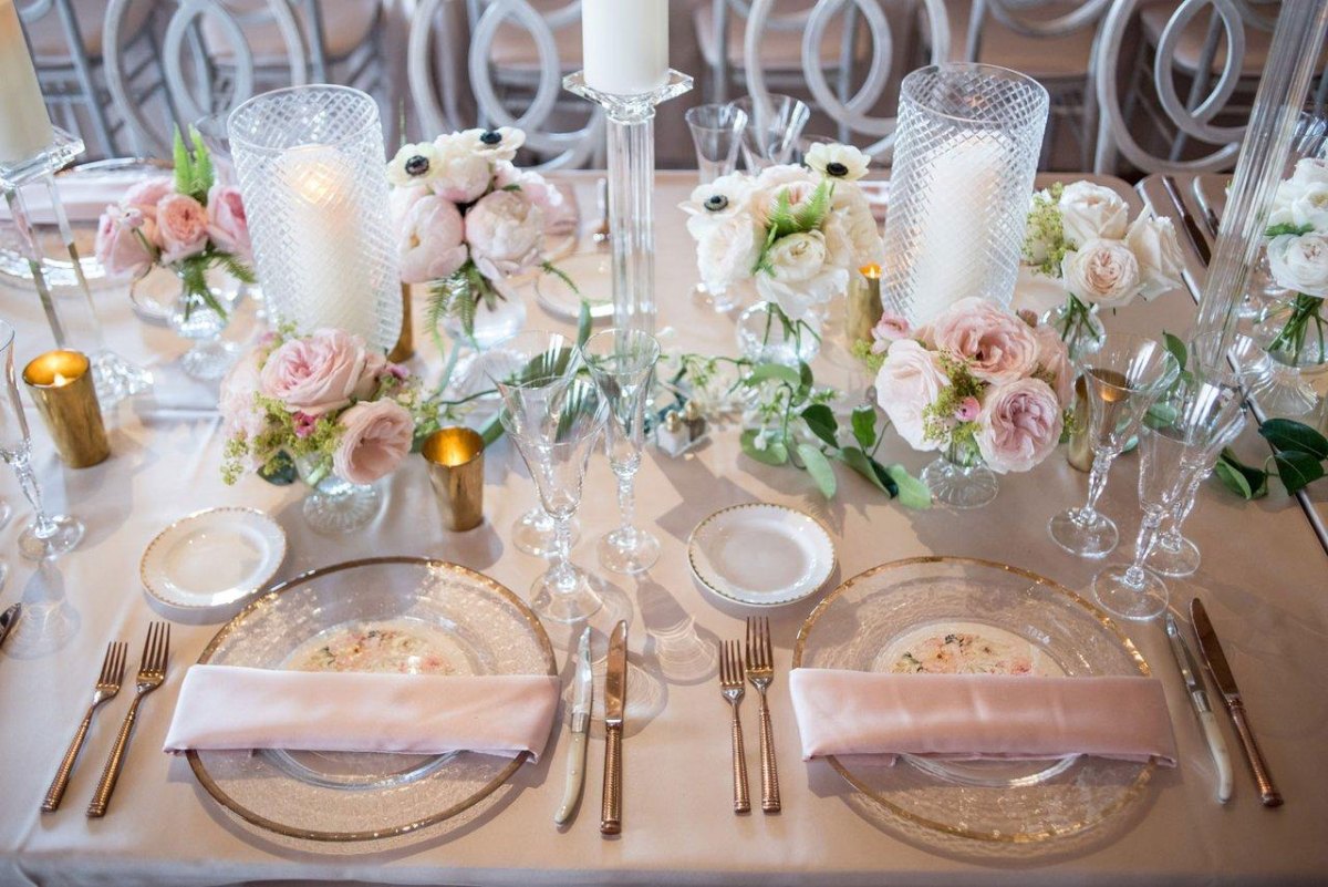
I have watched blush and champagne create some of the softest spring ceremonies. The pairing feels romantic without becoming overly sweet, especially when warm candlelight, ivory flowers, and subtle metallic details are involved.
For couples who want a classic garden feeling, I like using blush as the emotional color and champagne as the quiet background. The result feels elegant rather than decorated for decoration's sake.
Roz's quick take
- Best mood: Romantic garden elegance
- Helpful accents: Ivory, rose gold, soft greenery
Sage Green and Ivory Garden Wedding Palette
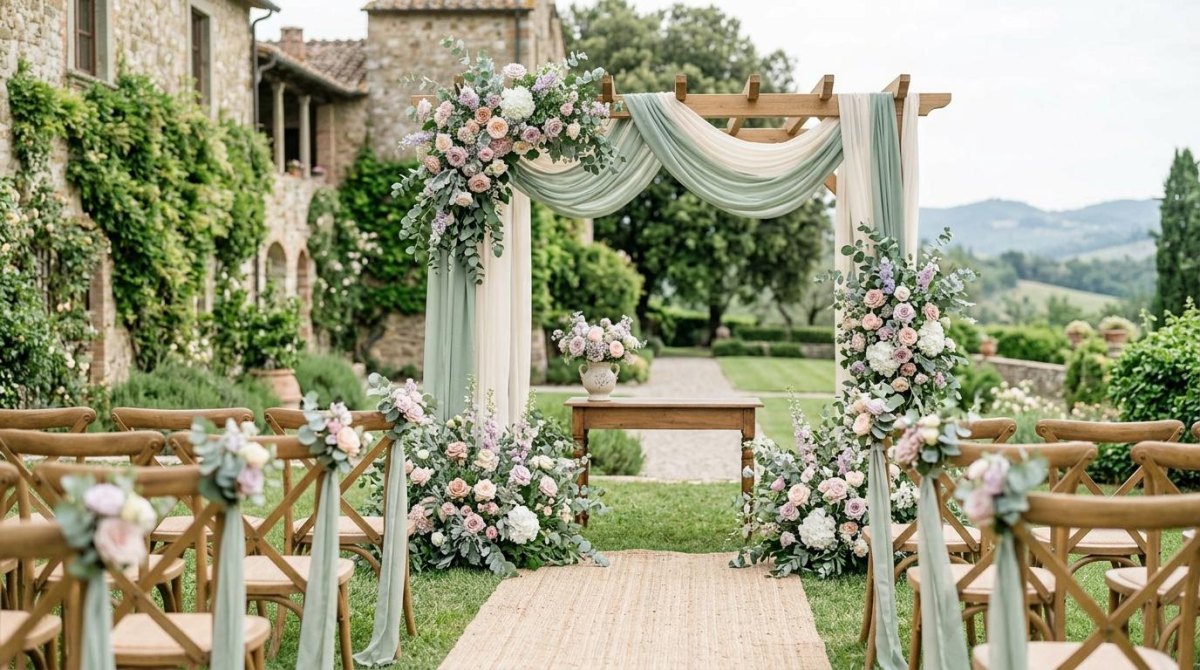
Sage green keeps appearing in ceremonies because it behaves almost like a neutral. I have seen sage and ivory palettes calm busy venues and make outdoor spaces feel intentional without looking staged.
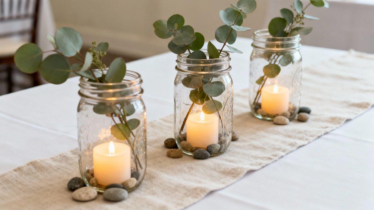
In a garden setting, this combination gives flowers room to breathe. I especially love eucalyptus, white roses, and linen textures because they add depth without shouting.
A practical tip
Use warm ivory instead of a harsh white if your venue has lots of natural greenery. It keeps the palette softer in photographs.
Lavender and Soft Gray Spring Wedding Palette
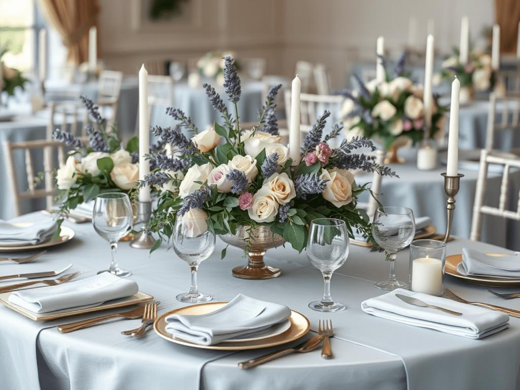
Lavender has a gentle personality, and paired with soft gray tones it becomes more sophisticated than sugary. I picture this palette at a spring evening ceremony with delicate flowers and simple stationery.
The gray gives lavender a little structure, which helps the overall design feel grown-up and timeless rather than like a pastel party.
Peach and Coral Spring Wedding Palette
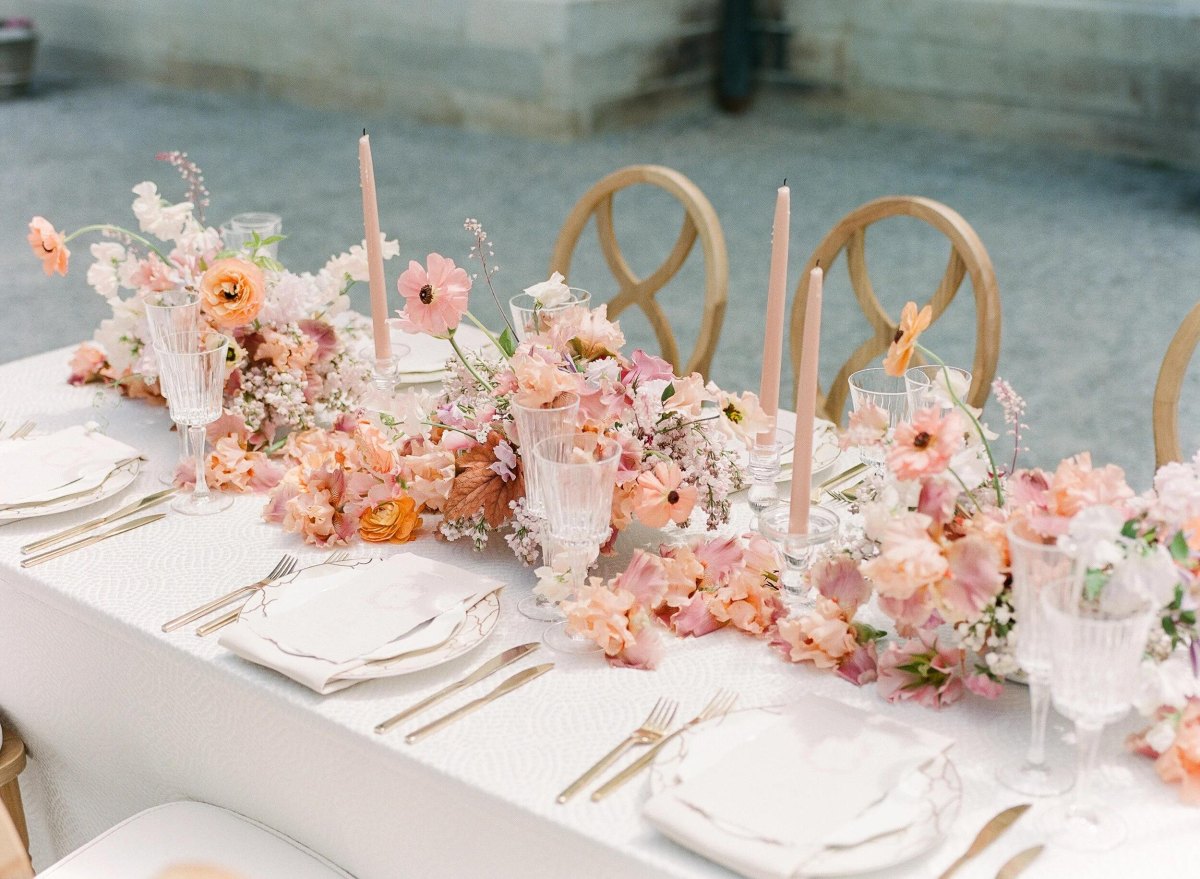
Peach and coral bring the warmth of spring sunshine into a ceremony. From the front row, these shades make bouquets feel alive because they have enough energy to stand out without overwhelming the couple.
I recommend peach with muted coral instead of bright orange tones when couples want a romantic look that still feels fresh.
Dusty Blue and White Spring Wedding Palette
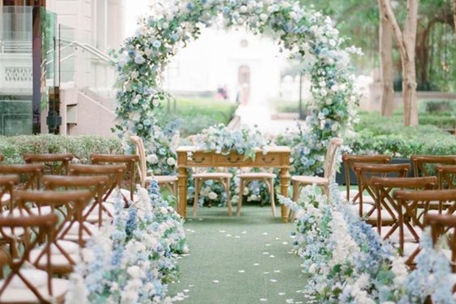
Dusty blue has a calm quality I love for ceremonies near water, stone buildings, or open skies. The combination of dusty blue and white feels clean, traditional, and easy to personalize.
I have seen couples use this palette with ribbons, invitations, and table linens while letting flowers provide the softer spring details.
Mint Green and Gold Spring Wedding Palette
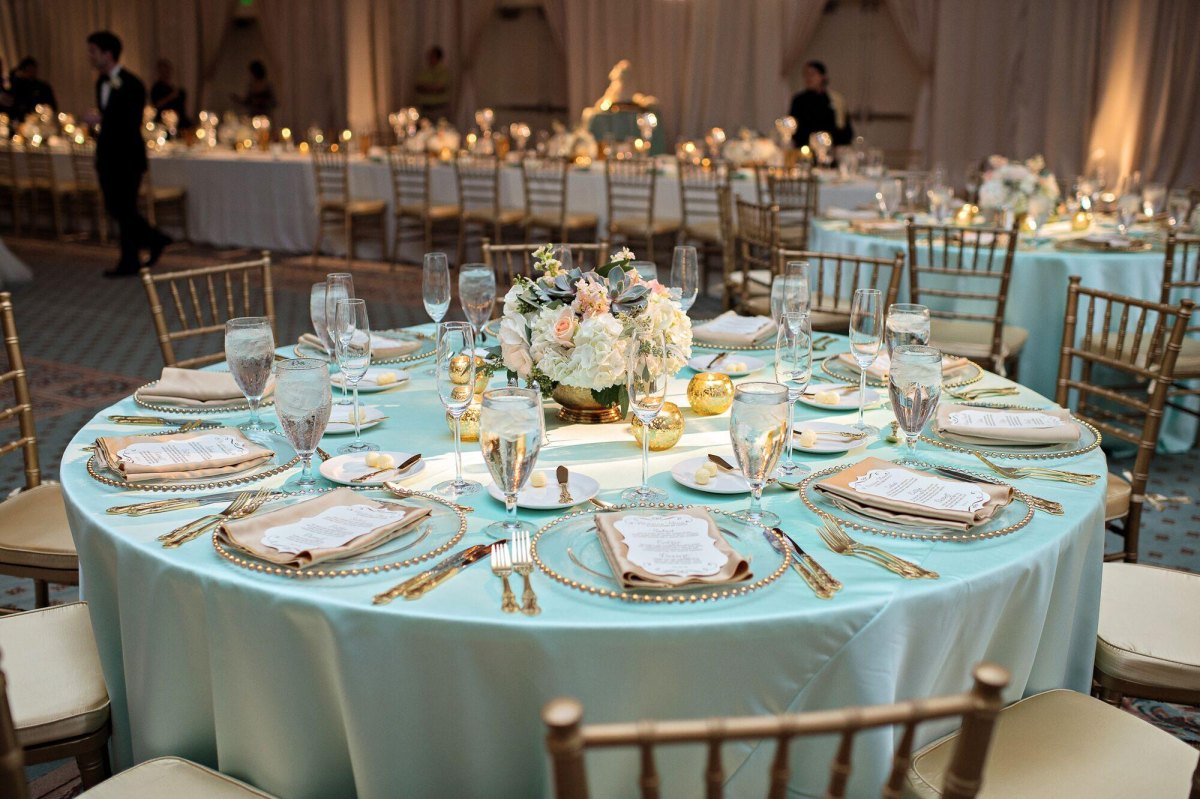
Mint green gives a spring wedding a lighter, almost vintage feeling. Adding gold accents keeps it from becoming too delicate and brings in a little celebration sparkle.
This works beautifully for couples who want a cheerful palette with personality, especially in historic venues or garden receptions.
Yellow and White Spring Wedding Palette
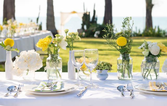
Yellow and white reminds me of the first warm mornings of spring. The palette feels optimistic, and I have seen it shine when couples use seasonal flowers rather than forcing elaborate decor.
The trick with sunny yellow details is balance. A little goes a long way, especially in bouquets and table settings.
Rose Pink and Burgundy Spring Wedding Palette
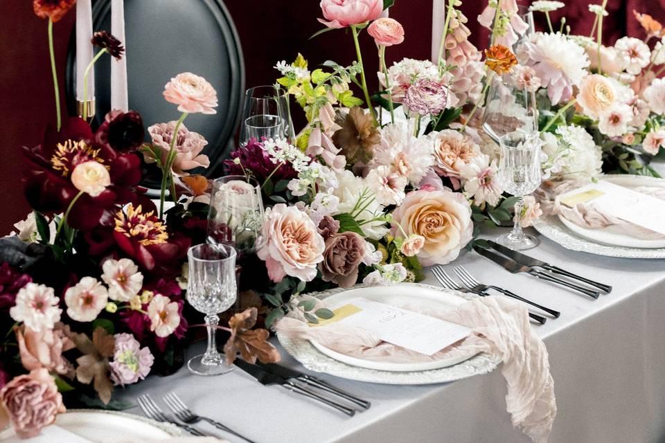
Rose pink and burgundy create a deeper romantic look for couples who want spring colors with more drama. The contrast gives bouquets and ceremony backdrops rich visual depth.
I would soften this pairing with cream or greenery so the darker tones frame the day instead of taking it over.
Peach, Sage, and Cream Spring Wedding Palette
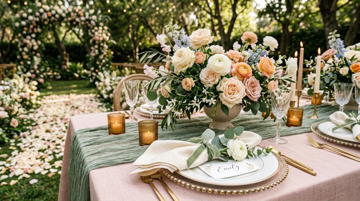
This is one of those combinations that feels natural the moment you see it. Peach adds warmth, while sage and cream balance everything into a relaxed garden atmosphere.
I like this palette for backyard weddings because it works with wood tables, greenery, and simple floral arrangements without needing expensive extras.
Emerald Green and White Spring Wedding Palette
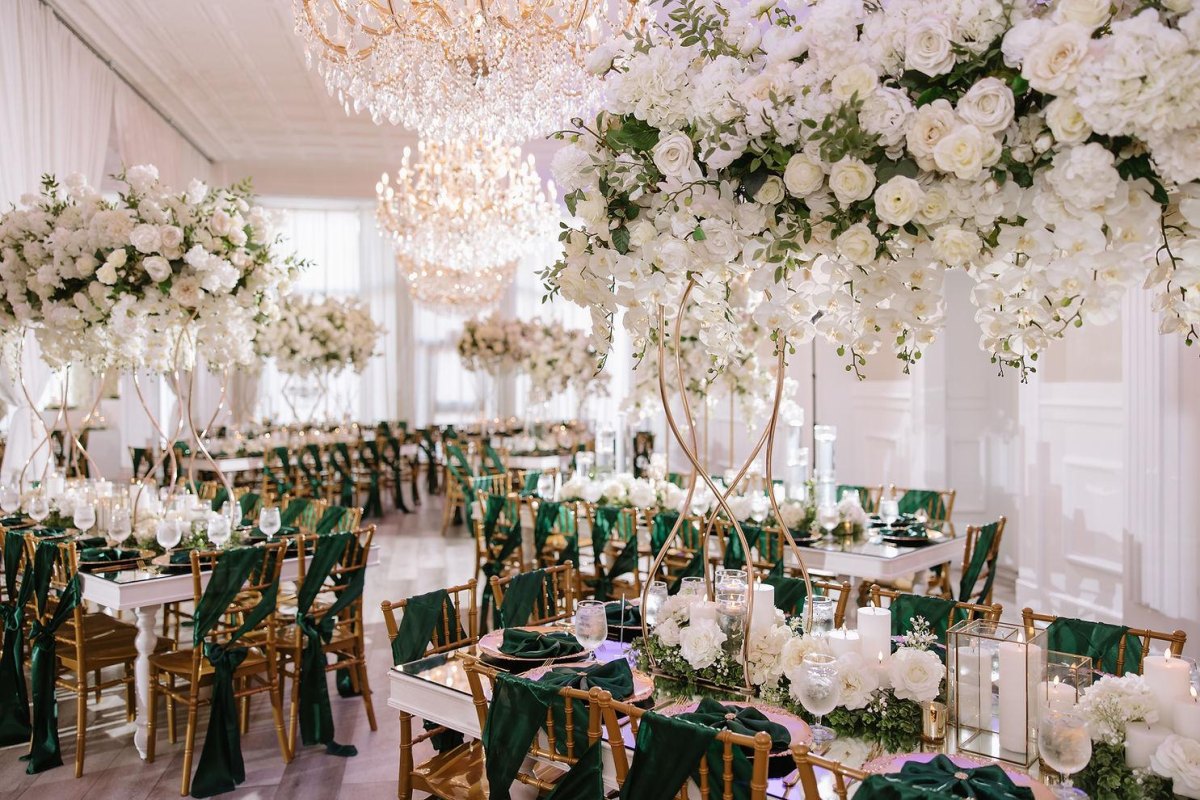
Emerald green is a stronger choice than sage, but it can be stunning when used carefully. I would place emerald as an accent through linens, foliage, or stationery rather than covering every surface.
White flowers against deeper green create a formal look that photographs beautifully in elegant venues.
Mauve and Blush Spring Wedding Palette
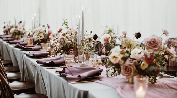
Mauve and blush are cousins that understand each other. Together they create a romantic softness that feels especially fitting for spring ceremonies with lots of flowers.
I love layered pink tones because they add dimension without requiring many different colors.
Terracotta and Soft Pink Spring Wedding Palette
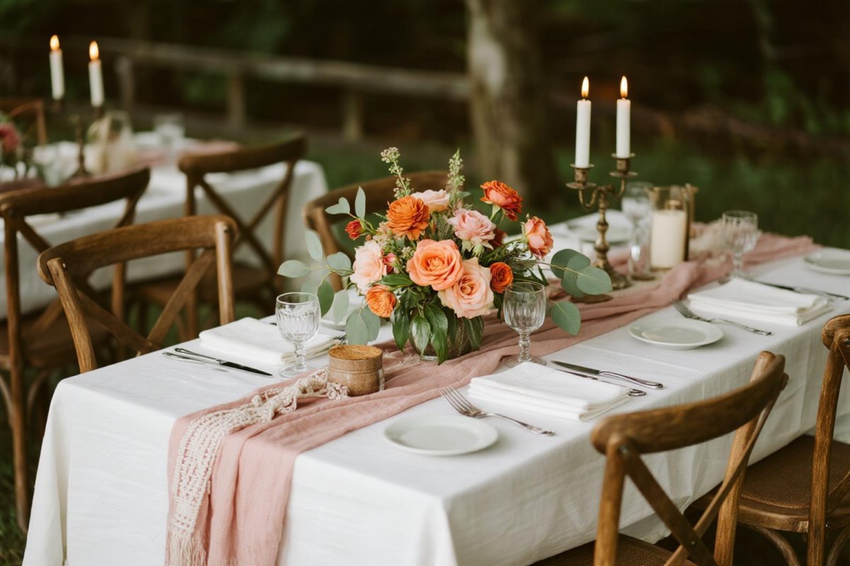
Terracotta brings warmth, while soft pink keeps the palette connected to spring romance. I have seen this combination work beautifully in desert weddings where earthy tones already belong.
The secret is choosing dusty terracotta shades rather than bright orange so the design feels elegant.
Blue and Lavender Spring Wedding Palette
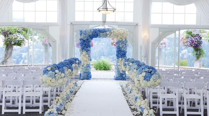
Blue and lavender create a peaceful spring palette that feels slightly whimsical. It reminds me of couples who want something different from the usual blush but still want softness.
Use cool floral tones with warm lighting so the ceremony does not feel too icy.
Neutral Beige and Green Spring Wedding Palette
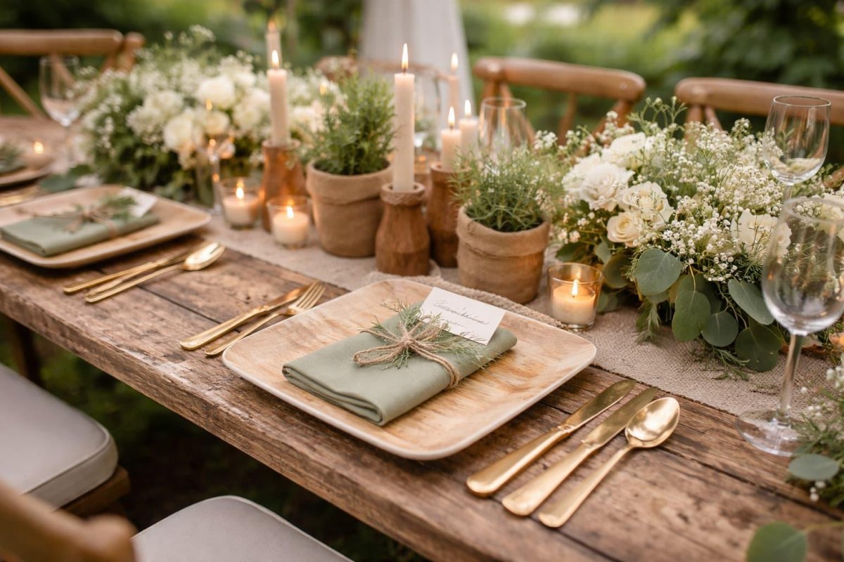
Neutral palettes can be beautiful when texture does the work. Beige and green give couples a quiet foundation where flowers, candles, and personal details become the stars.
I often suggest natural neutral layers for couples who want timeless photographs rather than a trend-heavy look.
Pastel Rainbow Spring Wedding Palette
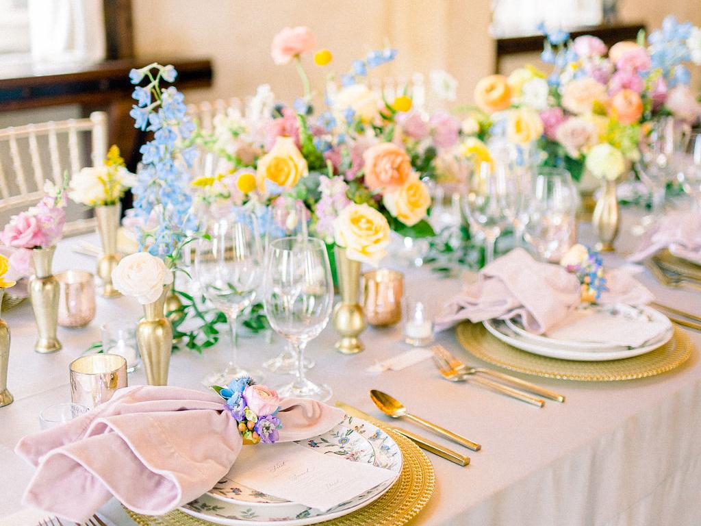
A pastel rainbow palette is for couples who want joy to be visible. When I see these ceremonies done well, every color has a purpose rather than competing for attention.
Keep soft rainbow tones consistent in saturation so the design feels playful but polished.
White and Green Minimalist Spring Wedding Palette
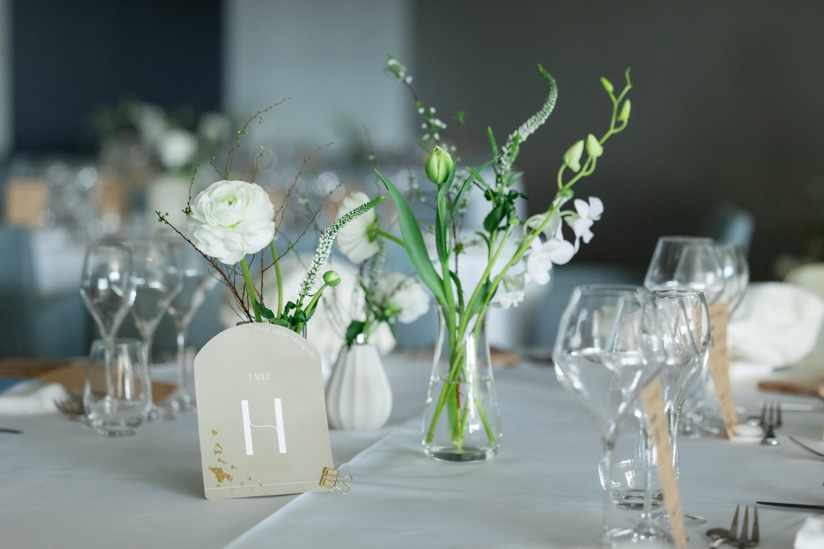
White and green is proof that simple does not mean plain. I have watched minimalist ceremonies feel incredibly emotional because the couple, not the decorations, remains the focus.
The beauty comes from clean floral choices, greenery movement, and thoughtful spacing.
Peach, Lavender, and Gold Spring Wedding Palette
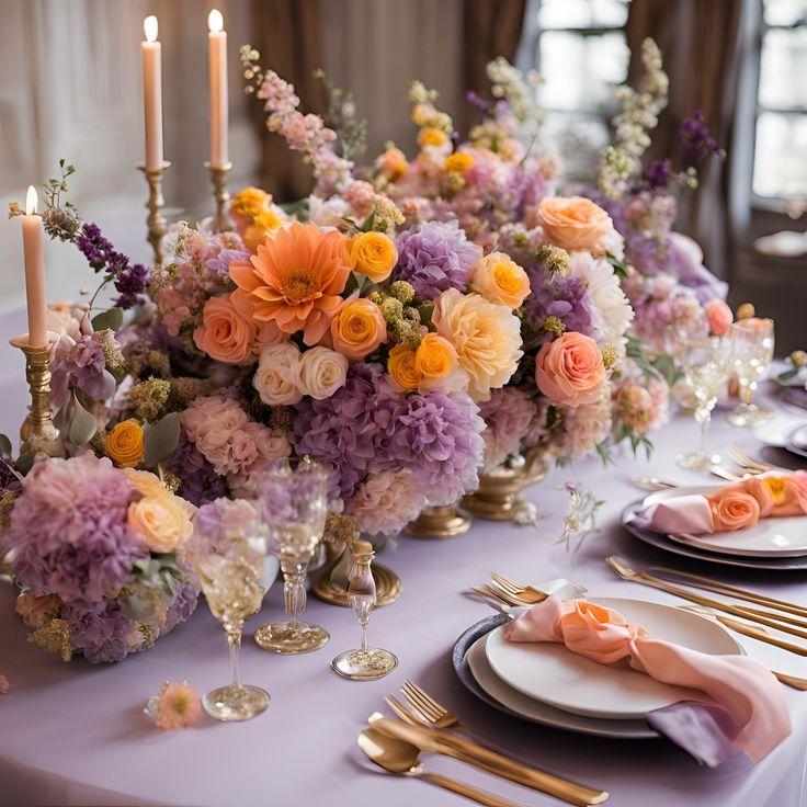
Peach, lavender, and gold combine warmth, softness, and celebration. It is a palette I would suggest for couples who want romance with a little more personality.
The gold accent details work best when they appear sparingly in frames, candles, or stationery.
Wildflower-Inspired Spring Wedding Palette
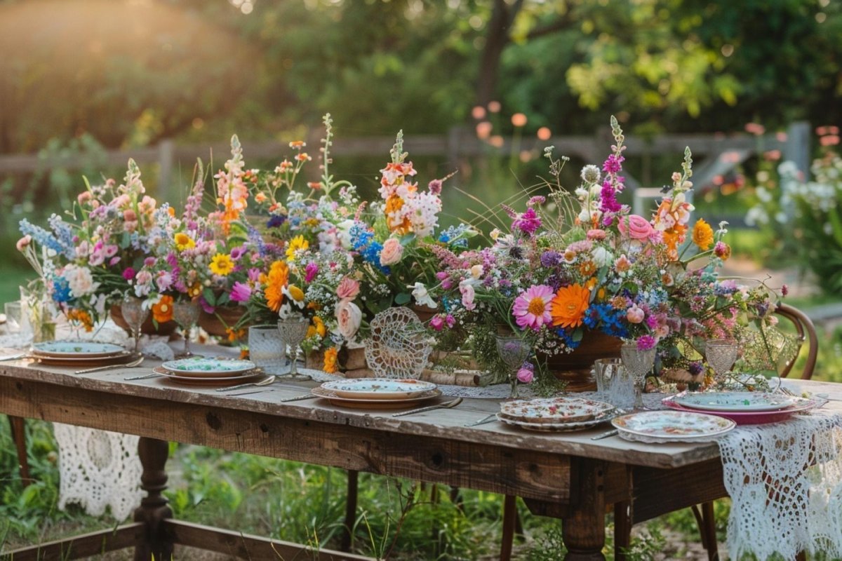
Wildflower-inspired weddings remind me that nature already knows how to mix colors. Some of my favorite ceremonies have used flowers that look gathered rather than perfectly arranged.
A wildflower color story can include blues, pinks, yellows, and greens while still feeling cohesive when the choices reflect the season.
One thing I tell couples
Your guests will remember how the ceremony felt long after they forget the exact shade of the napkins.
More Pinterest Visuals



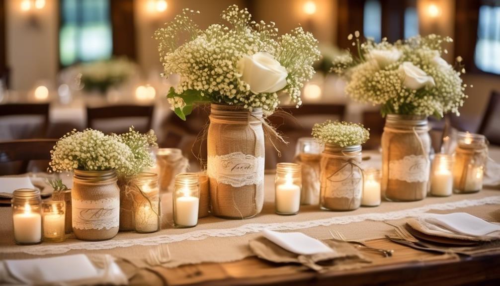 Wedding Decor7 Cheap DIY Wedding Decor Ideas That Look Beautiful Without the Big Budget
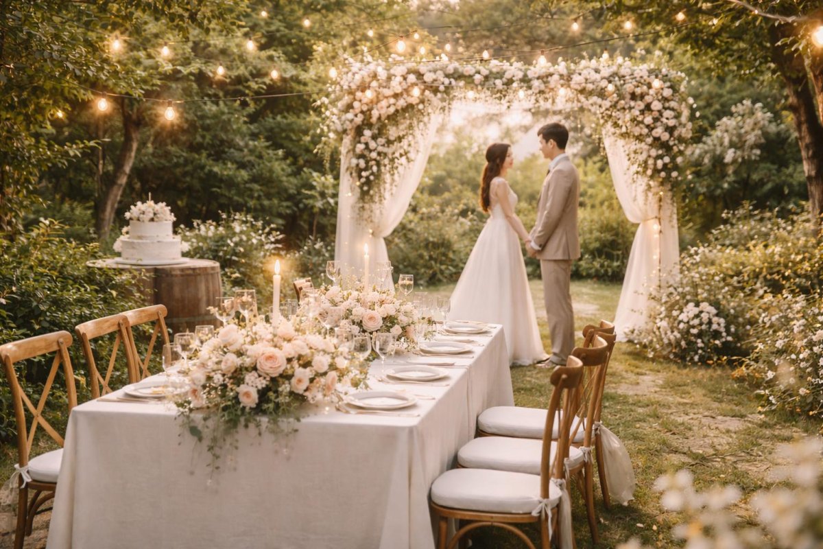 Wedding Planning12 Micro Wedding Venue Ideas For An Intimate
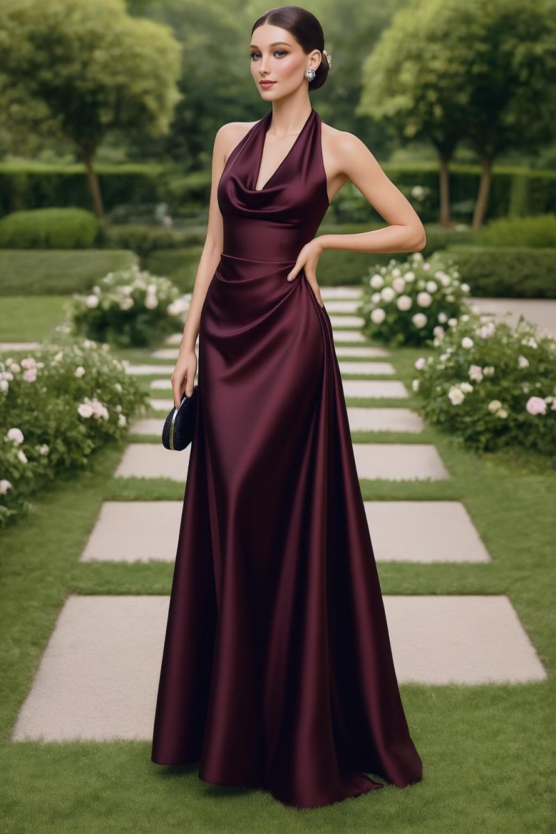 Wedding Guest Outfits14 Burgundy Wedding Guest Dress Ideas for an Elegant, Unforgettable Look
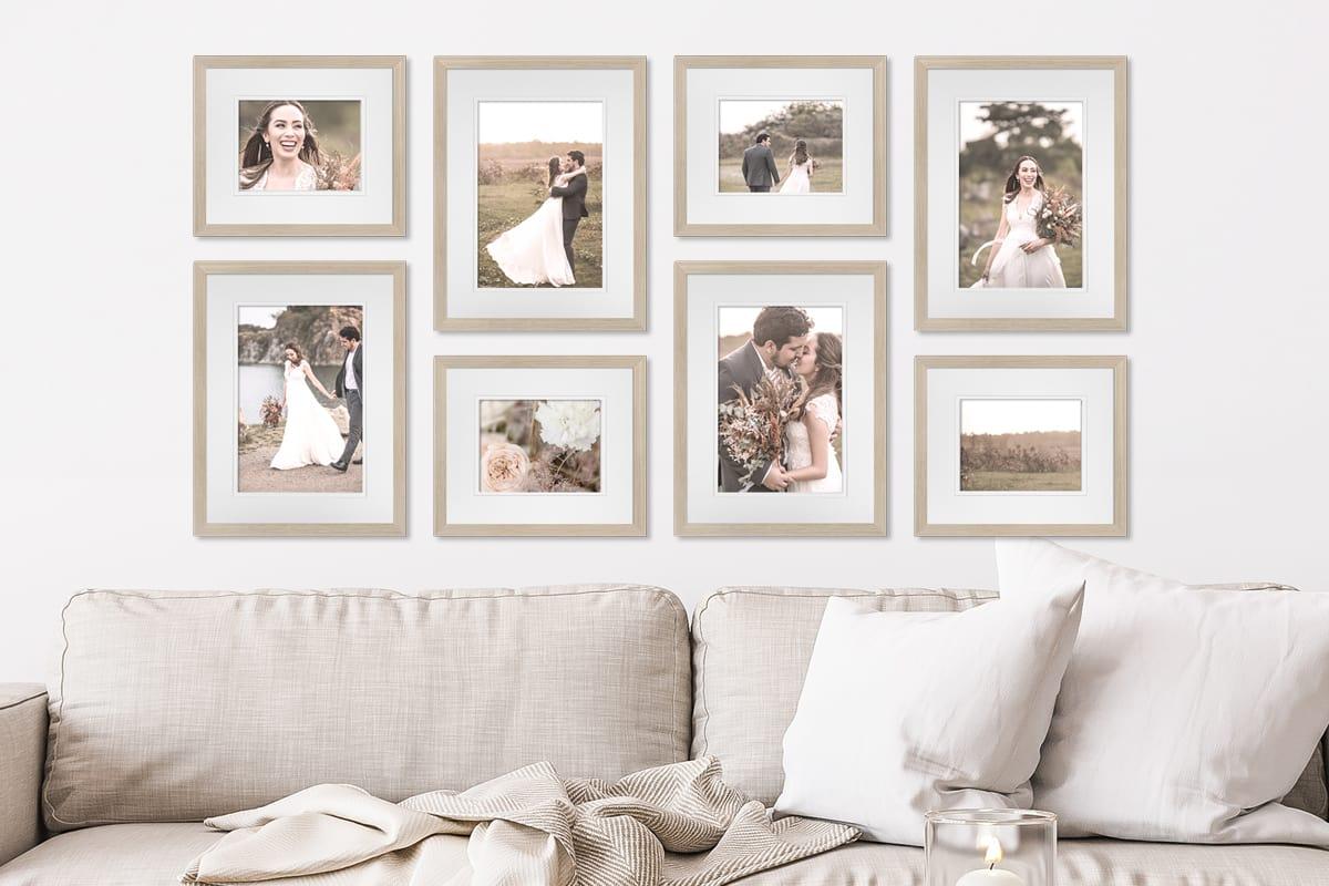 Wedding Decor12 Wedding Photo Display Ideas That Turn Your Memories Into Beautiful Decor