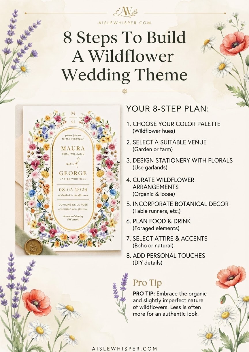
I don't design invitations — that's not my seat at this wedding, and I'll say that plainly before we start. But I sign the license three feet from where these color choices land, and after five hundred ceremonies I can tell you a wildflower theme carried through with intention, from the first swatch to the welcome sign, is one of the few decor decisions guests actually notice. Here's how the eight pieces stack, in order, and where I'd spend real care versus where I'd let it go.
Choose Your Color Palette
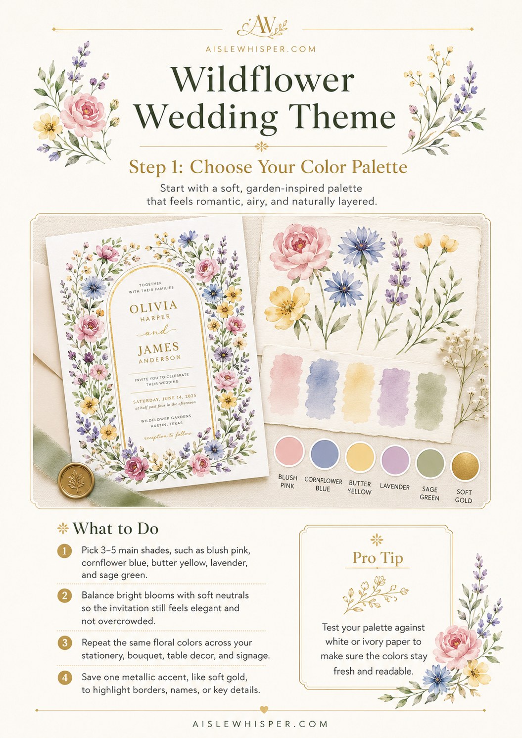
A wildflower palette isn't 'lots of colors' — it's a small, repeated set of soft, garden shades that reads as gathered rather than arranged. Blush pink, cornflower blue, butter yellow, lavender, and sage green is the classic starting five, and there's a reason it keeps showing up: it mimics what actually grows together in a meadow instead of a florist's cooler.
- Pick 3-5 main shades — more than that and the eye stops resting anywhere.
- Balance bright blooms with neutrals so the invitation stays legible instead of loud.
- Repeat the same colors across stationery, bouquet, and table decor rather than inventing a new mix for each.
- Save one metallic, soft gold usually, for names and key details only.
One thing I'll add from standing outside a lot in Arizona light: pastels wash out fast in direct sun. If your ceremony is outdoors midday, test the palette against harsh light, not just white cardstock, before you commit.
Build the Floral Border
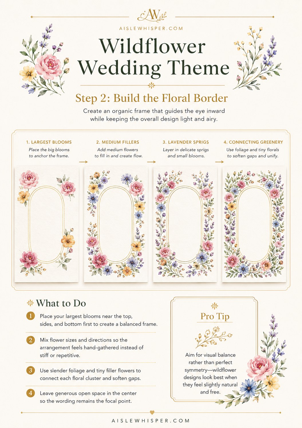
The border is what makes a wildflower invitation feel hand-gathered instead of clip-art. It's built in layers, and the order matters:
- Largest blooms first — anchor the frame at the top, sides, and bottom before adding anything else.
- Medium fillers next to create flow between the anchor blooms.
- Lavender sprigs and small blossoms layered in to add delicacy.
- Fine greenery last, connecting each cluster so nothing floats alone.
The goal is asymmetry that still feels balanced — mix flower sizes and directions so the arrangement looks like it was picked by hand, not stamped from a template. Leave the center open. That negative space is where your wording lives, and a border that closes in too far makes the whole card feel cramped no matter how pretty the flowers are individually.
Create the Arched Layout
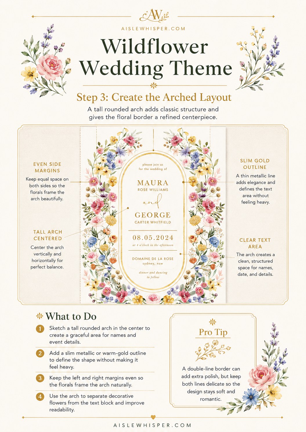
Why the arch works
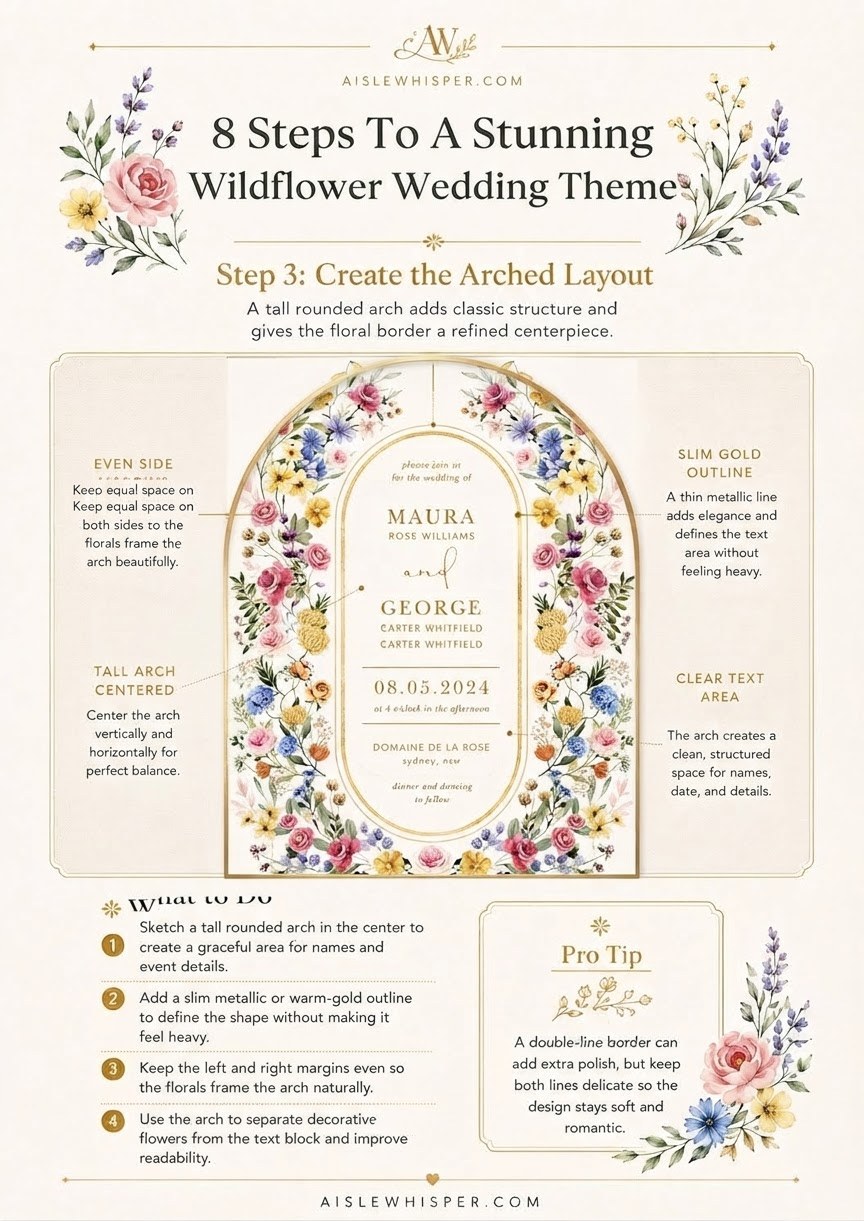
A tall, rounded arch does something a straight rectangle can't: it gives the floral border a clear place to gather and gives your names and date a structured, protected space in the middle. It reads as classic without tipping into stiff.
To build it well: center the arch vertically and horizontally so the whole layout feels intentional rather than off-balance, keep even margins left and right so the florals frame the card naturally, and use a slim gold or warm-toned outline to define the arch's shape without adding heaviness. A double-line border, thin inside thin, can add polish while staying soft. Keep the text area inside the arch genuinely clear — no floral overlap on names or the date. I've watched guests squint at invitations at the mailbox; if the arch is doing its job, they shouldn't have to.
Choose Fonts and Hierarchy
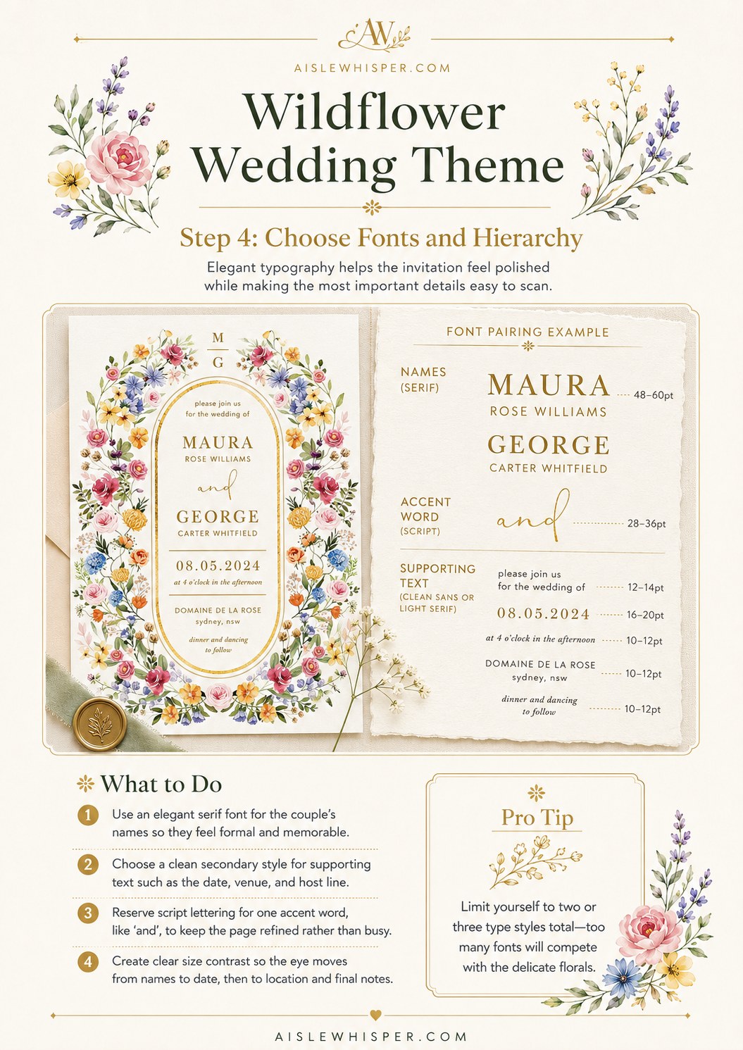
Eighteen years of grading essays taught me that legibility is a kindness, not a design compromise, and it applies here just as much as it did to a term paper. Elegant doesn't mean hard to read.
- Use a refined serif for the couple's names — the largest text on the page, and the thing people scan for first.
- Reserve script for one accent word, like 'and,' so the page stays readable and the script feels special rather than exhausting.
- Keep supporting text — date, time, venue — in a clean, simple style at a smaller size.
- Limit yourself to two or three type styles total. More than that and the invitation starts competing with itself.
Create clear size contrast between names, date, and location so a guest's eye moves in the right order without having to work for it.
Write the Invitation Wording
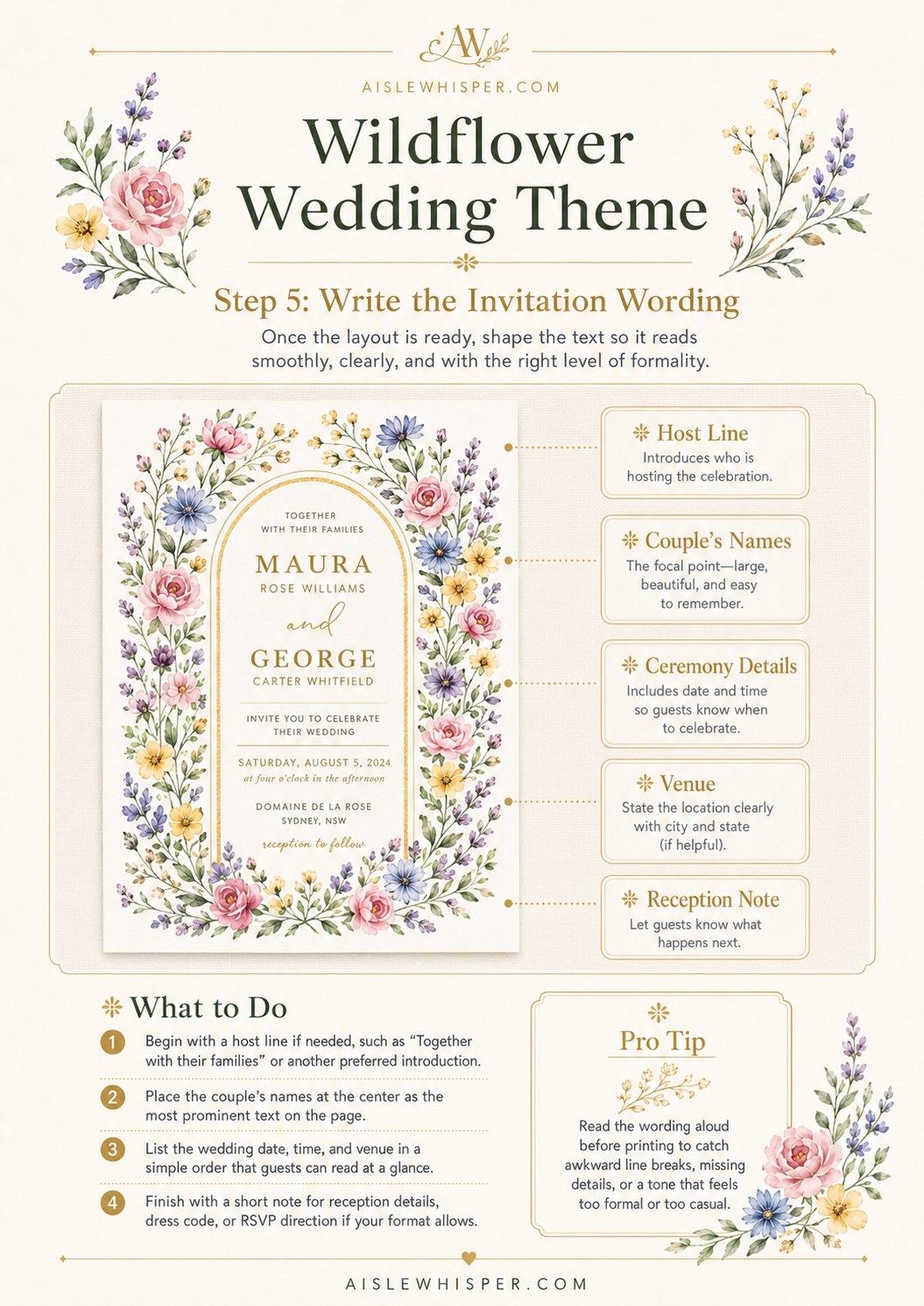
This is the part closest to my actual craft, and it's also the part couples most often either overthink or copy wholesale from a template. Don't do either.
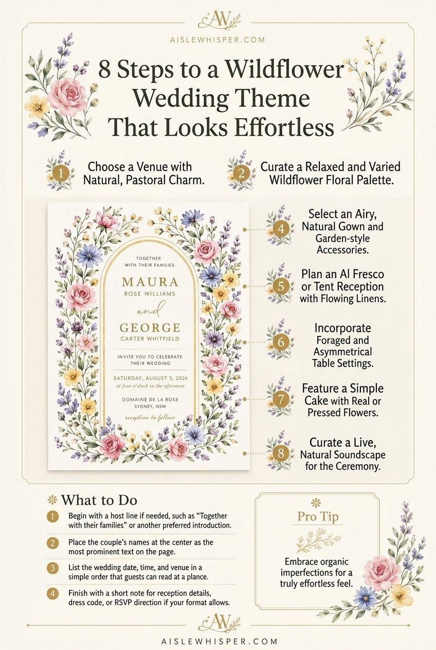
The order that reads cleanly: host line, if you're using one; the couple's names, largest and most prominent; ceremony date, time, and venue stated simply; a short reception note if the invitation is doing double duty.
Read every version of this wording out loud before it goes to print. The eye forgives an awkward line break. The ear catches it every time.
Decide your formality level and stay consistent with it — 'request the honor of your presence' and 'invite you to celebrate' aren't interchangeable, and mixing registers is the single most common wording mistake I see couples make when they're borrowing lines from three different sample sets. Pick one voice and keep it through host line, names, and closing note.
Choose Paper, Printing, and Embellishments
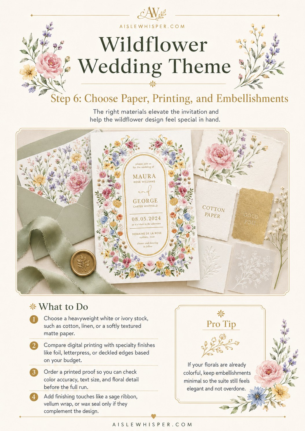
Paper stock is where the wedding tax hides most quietly. A heavyweight cotton or textured stock genuinely changes how an invitation feels in the hand — but it's also where I've watched couples spend the most for the least guest memory. Nobody at the reception remembers the deckled edge on your save-the-date.
What's worth the money: a printed proof before the full run, so you catch color shifts and floral detail issues while they're still cheap to fix. What's optional: foil, letterpress, or deckled edges — nice, not necessary. My rule of thumb once the florals are already this colorful is to keep embellishments minimal — a sage ribbon or a single wax seal, not both plus a vellum wrap. Overdone stops reading as elegant and starts reading as busy.
Extend the Theme to Day-Of Decor
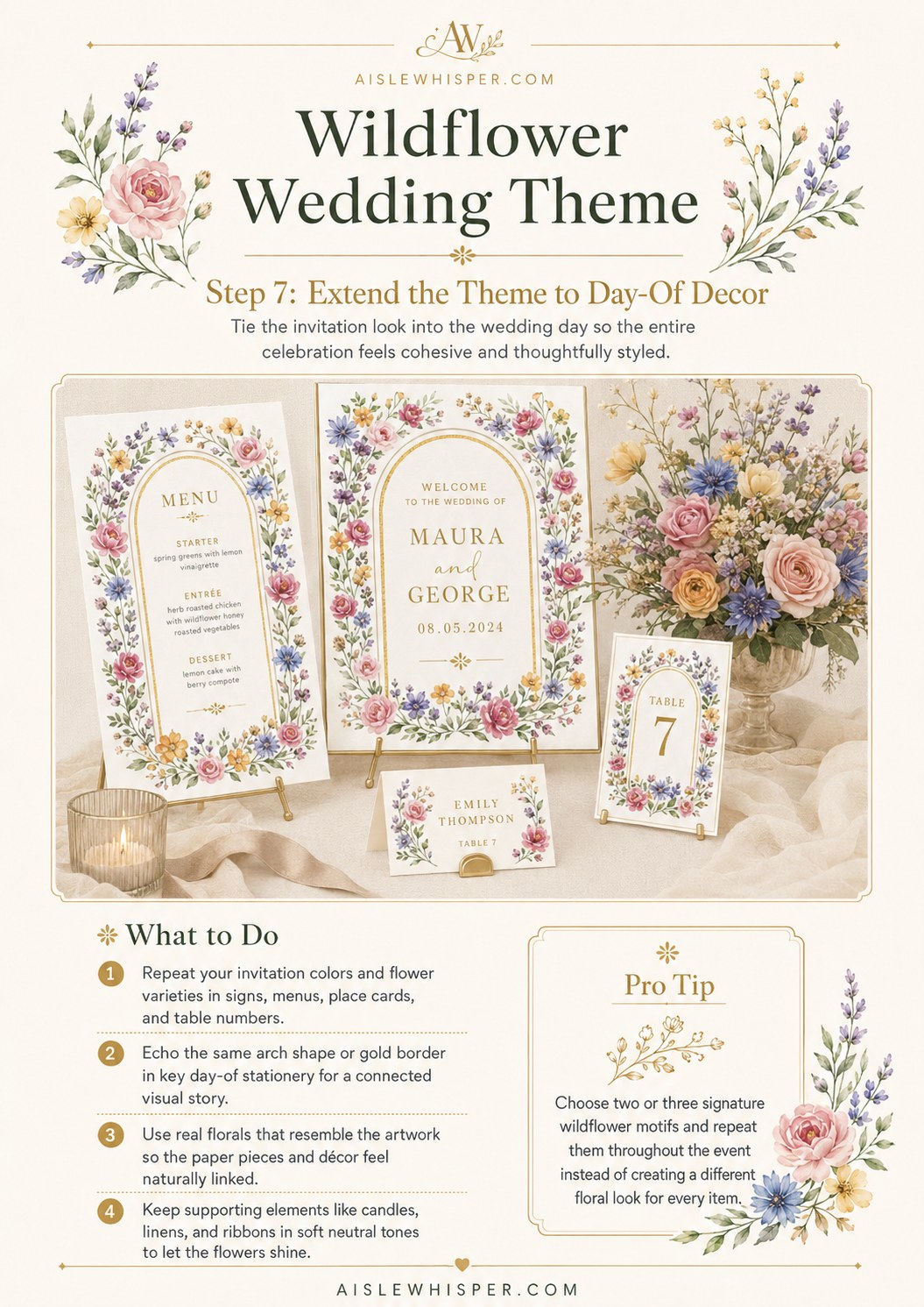
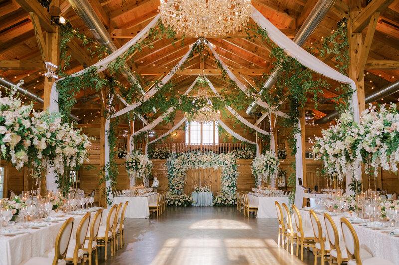
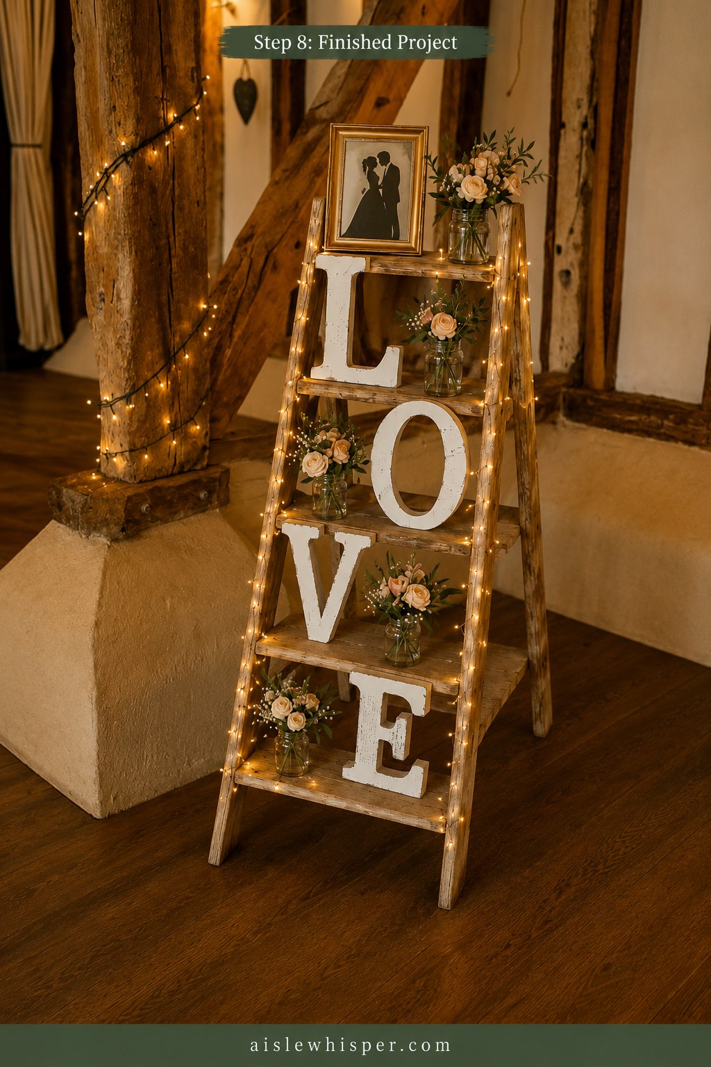
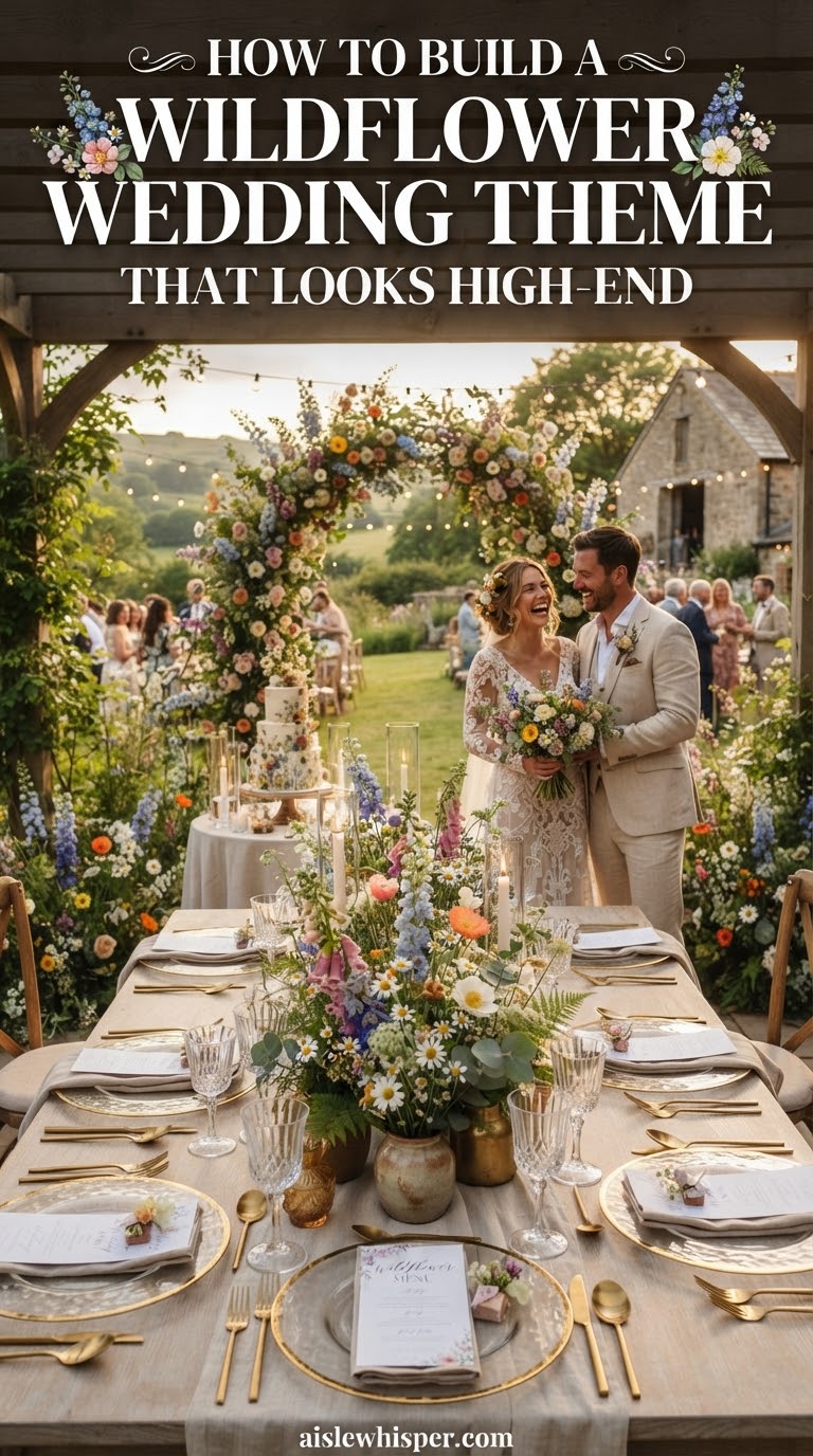
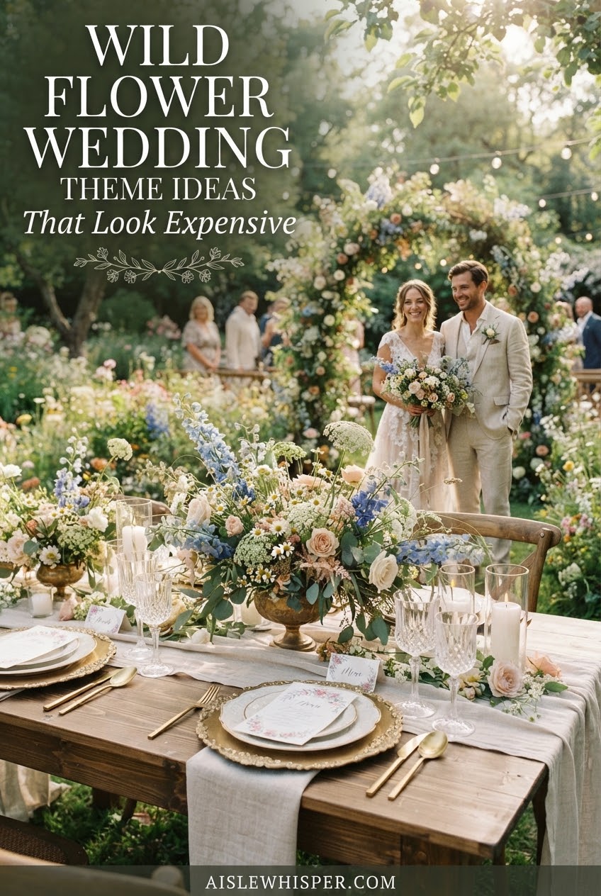
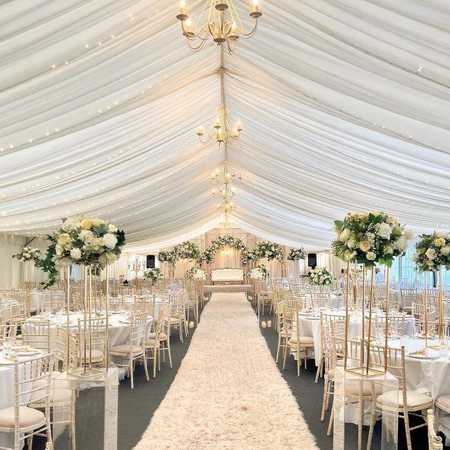
This is where a wildflower theme either holds together or falls apart, and it's less about matching everything perfectly than about repeating a handful of signature elements on purpose.
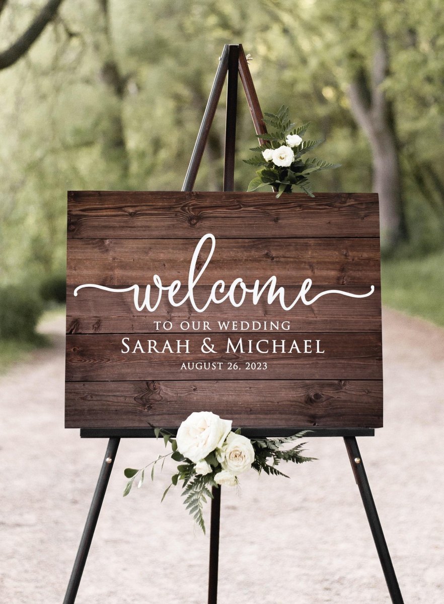
- Repeat your invitation colors and floral varieties on signs, menus, place cards, and table numbers.
- Echo the arch or gold border from your stationery in at least one day-of piece for visual continuity.
- Use real florals that resemble the illustrated artwork rather than something that fights it.
- Keep linens and ribbons neutral so the flowers stay the focal point, not the tablecloth.
Choose two or three signature motifs and repeat them rather than trying to make every arrangement identical — a slightly different floral mix at each table still reads as cohesive if the palette and a couple of anchor blooms carry through. That's the difference between 'themed' and 'matchy,' and guests notice the first far more than the second.
Style and Photograph the Final Suite
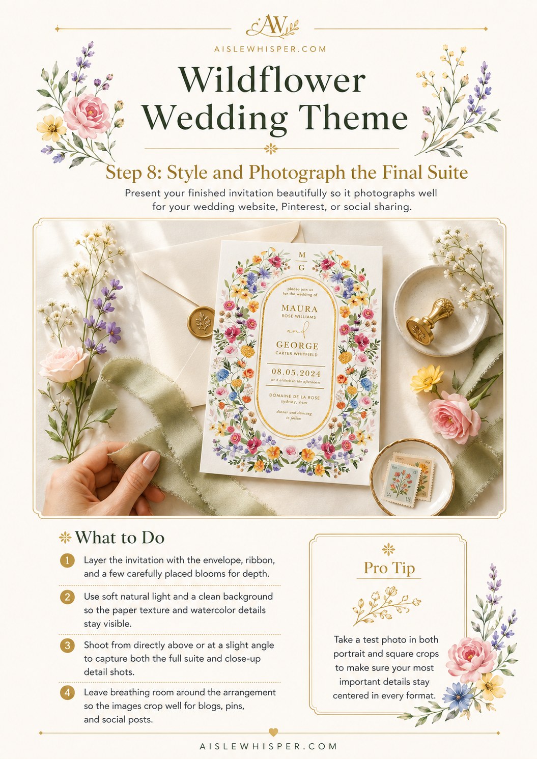
I'm going to defer to actual photographers here, because flat-lay styling isn't my vantage point — but I've watched enough of these suites get pulled out for a wedding website or a framed keepsake to know what holds up later.
Layer the invitation with its envelope, ribbon, and a few carefully placed blooms for depth rather than laying it flat and bare. Natural, soft light on a clean background keeps the paper texture and watercolor detail visible instead of blown out. Shoot straight-on for the full suite, then at a slight angle for texture close-ups, and leave breathing room around the arrangement — tight crops get awkward fast once you're placing the same image into a square Instagram frame and a rectangular blog header on the same day.
The wildflower suites I remember best weren't the ones with the most embellishment — they were the ones where three or four blooms showed up on the invitation, the menu, and the table number, and nobody fussed past that. That restraint is the whole trick.

Common Questions
Does a wildflower theme work for a more formal wedding, or is it only casual?
It scales further than people assume. A tighter, more restrained palette with a lot of white space and a formal font pairing reads elegant in a ballroom just as easily as a looser, brighter version reads casual in a backyard. The formality lives in your wording and paper choice more than in the flowers themselves.
How many colors should actually be in a wildflower palette?
Three to five main shades, plus one metallic accent for names and key details. More than that and the design stops feeling curated and starts feeling scattered, even if every individual color is pretty on its own.
Can I use real, foraged wildflowers if my ceremony is outdoors?
Sometimes, but check first. Many public lands, parks, and trailheads restrict or prohibit picking flowers, and I've watched couples plan a whole aesthetic around foraged blooms without confirming the rules for that specific piece of land. Verify with the managing agency, and pack out anything you bring in — Leave No Trace applies to your wedding day too.
Is it worth paying extra for letterpress or foil printing?
It's a preference purchase, not a necessity. I've officiated plenty of weddings with beautifully digital-printed invitations that nobody could tell apart from letterpress once they were in a frame six months later. Spend there if it genuinely delights you, not because you feel like it's required.